Adding report parts

A dashboard report contains a collection of report parts that visually show your company information.

Note: You must have a Mobile Dashboard Designer license to create dashboard reports and report parts.

To add a report part to a dashboard report that is open in design mode:

  1. In the report part box in the Report Body panel, click to select one of the general report part types. (The Map report part type is not supported yet.) More...

    The report part type selection choices

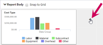
    If a new report part is not shown, either click [Add Report Part] (in the upper right of the page) or click (the plus sign) on the gray report background.

    The area of the page showing the Add Report Part button

    The plus sign on the background

  2. (Optional) To differentiate this report part from others and help when you select the report part for dashboards, change its name. More...

    1. Hover over the Configuration area of the report part (to display the blue bar).

    2. Type the new name and press Enter.

      The area with the name of the report part

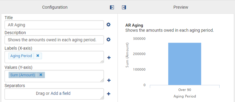
  3. (Optional) In the Configuration area, type the title and description for the report part. More...
    • For Title, type the title to appear at the top of the report part.
    • For Description, type text (such as instructions) to appear under the report title.

    The Configuration area with the Title and Description

    Note: You can also change the font and alignment of the title and description by clicking (the settings icon), making your selections, and clicking [OK].

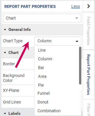
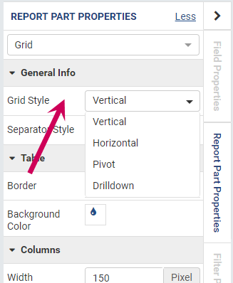
  4. Select the specific type of report part:

    1. Open the Report Part Properties pane by clicking the < arrow in the upper right and then clicking the Report Part Properties tab.
    2. In the General Info section of the pane, select the type. Hover over the choices to see samples. Examples...
  5. In the Configuration area, select the fields to use for Labels, Values, Columns, and/or Separators.

    To add a field, you can either:

    • Drag a field from the panel on the left into the Labels, Values, Columns, or Separators box.
    • Click Add a field in the Labels, Values, Columns, or Separators box, select the check box before the field in the Field Selection window, and click [OK].

    After you select fields for these items, a sample displays in the Preview area of the Report Body panel.

  6. Click [Save] (in the upper right of the page).

    Important! When saved, the report is shown in Preview mode. To make additional changes, switch back to Configuration Mode by clicking (the Switch to Configuration Mode icon) in the upper right of the report part.

  7. (Optional) Customize the fields you choose in the Labels, Values, Columns, and/or Separators boxes. More...

    1. At the top right of the Field Properties pane, select the field you want to customize.

      Note: If this pane is not in view, click the < arrow in the upper right and then click the Field Properties tab.

    2. For Field Name Alias, type the text that you want for this field and press Enter. The preview then shows this text for the axis label.
    3. For Function, you may not need to select another function from the list.

      Note: In some cases, you may need to select Sum Distinct instead of Sum to sum the correct transaction amounts ¾or Count Distinct instead of Count to prevent duplicates in the count.

    4. For Format, select from the choices for how to display the item. For example, for dollar amounts, you can select a format the includes the dollar sign and commas.
  8. (Optional) Customize the colors of a field in a chart or gauge. More...

    1. At the top right of the Field Properties pane, select the field you want to customize.

      Note: If you select a color for a label field in a chart, that color will be used for all values.

    2. Click (the color drop icon) after Color.
    3. In the Cell Color Settings window, select Value, Value Range, or Percentage Range.
    4. Click [Add Setting].
    5. If you selected a range, specify the values for the range. For example, you can use different colors for negative and positive amounts.
    6. Click the box under Color Settings.
    7. In the Color Picker window, select the color and click [OK].
    8. In the Cell Color Settings window, click [OK].
  9. (Optional) Add a legend. More...

    1. In the Report Part Properties pane in the Legends section, click (the settings icon).

      Note: If this pane is not in view, click the < arrow in the upper right and then click the Report Part Properties tab to open the panel.

    2. In the Legend Settings window, select the Visible check box. The preview then shows the legend with the default placement and colors.
    3. You can change the horizontal and vertical alignment, the text (and its color and thickness), and the font used.
    4. Click [OK] to save the legend settings.
  10. (Optional) (Grids only) Add subtotals. More...

    1. In the Configuration pane, select the field in the Columns box that you want to subtotal.

      In the Field Properties pane for Sub Total, click (the settings icon).

      Note: If this pane is not in view, click the < arrow in the upper right and then click the Field Properties tab to open the panel.

    2. In the Subtotal Settings window, type the label to use for the subtotals and select Numeric for Data Type.
    3. For Format, select the format, such as to include the dollar sign.
    4. Click [OK] to save the subtotal settings.
  11. Save your changes by selecting Save > Save As (in the upper right of the page).